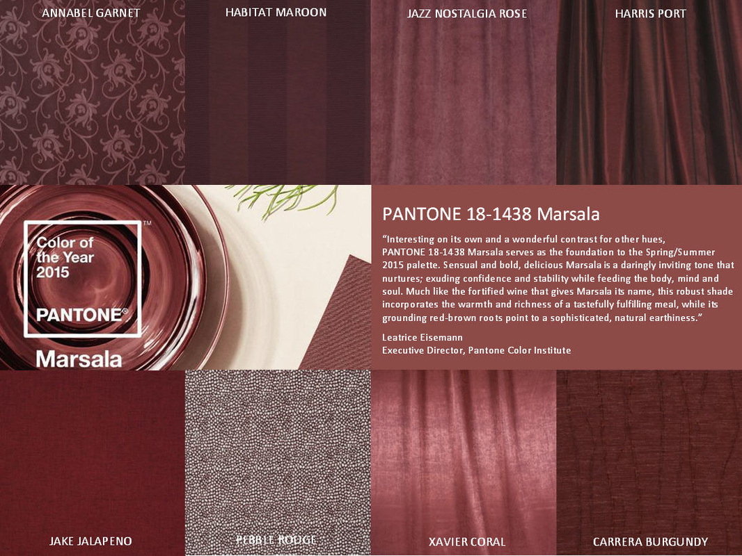
2015 color of the year, Marsala
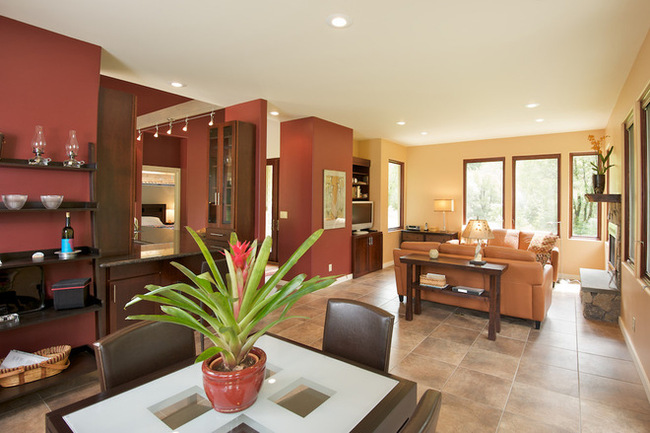
Marsala is classic and pairs well with Navy and Camel for a traditional look.
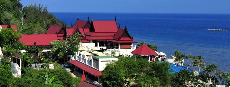
Marsala paired with Aquamarine and Scuba Blue create a Mediterranean feel.
In recent years, we’ve seen Radiant Orchid (purple) 2014, Emerald (green) 2013, Tangerine (orange) 2012 and –gak! -- Honeysuckle (pink) 2011.
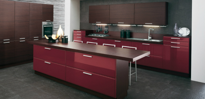
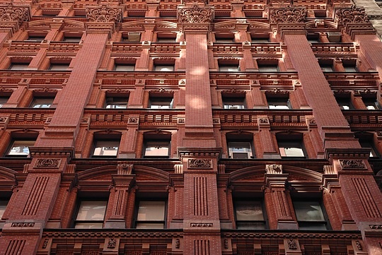
This year, the global design cabal known as Pantone has settled on a hue people actually like for the color of the year. Pantone is calling it Marsala, named after the dark red wine. It’s re-brown or cherry chocolate color.
I’m excited to work with it! Its classic and pairs well with Navy and Camel for a traditional look. When you pair Marsala with Aquamarine and Scuba Blue you create a more Mediterranean feel.
Pantone is a company that specializes in colors for paint, fabric, clothing and interiors. The company tries to predict trends in color and studies color’s effect on marketing.
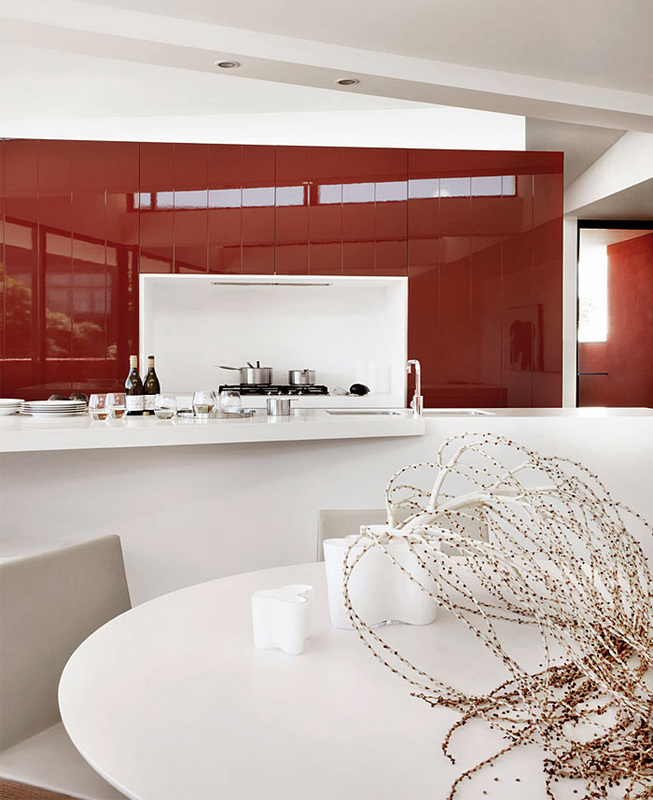
Once a year the company designates a color of the year for designers to incorporate in their latest offerings. Marsala has been chosen as the color of the year for 2015, so designers and manufacturers are racing to use it. Soon you’ll find items everywhere showcasing Marsala in clothing, accessories, furnishings, fabric, home décor and kitchen items.
Here’s Pantone’s description: “Much like fortified wine that gives Marsala its name, this tasteful hue embodies the satisfying richness of a fulfilling meal, while its grounding red-brown roots emanate a sophisticated, natural earthiness. So drink up !
Cheers, Kathy

2014
Radiant Orchid with Light Wood are the Trends in 2014
Radiant Orchid is Pantones color trend for 2014
According to Pantone, the color radiant orchid inspires confidence and emanates great joy, love and health. Radiant orchid is also said to encourage expanded creativity and originality. A great way to introduce this hot new color trend in your home is with toss pillow, cushions and place mats. You can add splashes of this color with artwork and patterned rugs which will not dominate the room with one color.
I've added a nice example of how to use Radiant Orchid in a room, via an area rug. Because it’s rather bold, the color packs a nice punch when used as an accent with furnishings and accessories. The Radiant Orchid is warmed by the honey colored woods to create a exciting and welcoming room.
Light woods for 2014
The trend is moving away from dark espresso and black woods and taking on a new life with lighter stains and finishes. Floors and furniture are going into light woods. This year, caramel and honey tone woods have made a real splash. This tone of wood is softer and goes well with most design styles and keeps your furniture from looking to heavy.
Metallic is in!
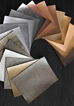
Metallic finishes are becoming warmer with lots of antique brass, brushed gold and copper on the market. Sparkle has found its way into all design styles with the use of large mirrors, crystal lamp bases and acrylic furniture and accessories.
Metallic finishes are becoming warmer with lots of antique brass, brushed gold and copper on the market. Sparkle has found its way into all design styles with the use of large mirrors, crystal lamp bases and acrylic furniture and accessories.
